← Index 05 / 17
Channel 13
An identity bold enough to hold together everything a national network broadcasts.

The challenge
Give a national television network one identity strong enough to carry news, prime-time and promotion without breaking character — and legible enough that the teams applying it every day, long after the design work ends, can extend it without asking.
The idea
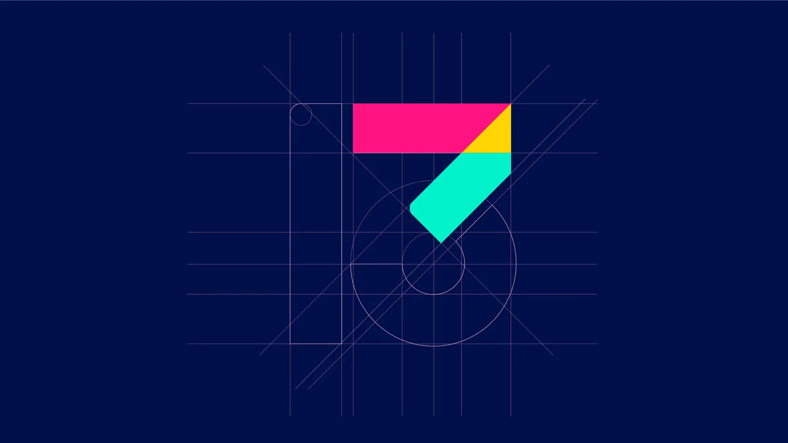
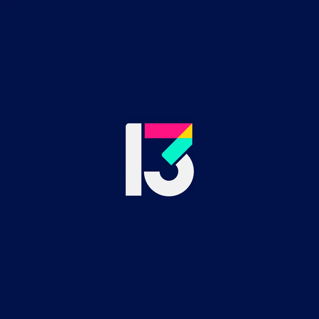
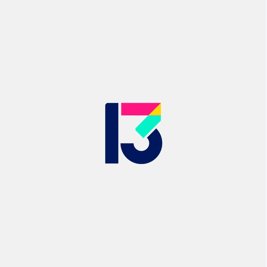
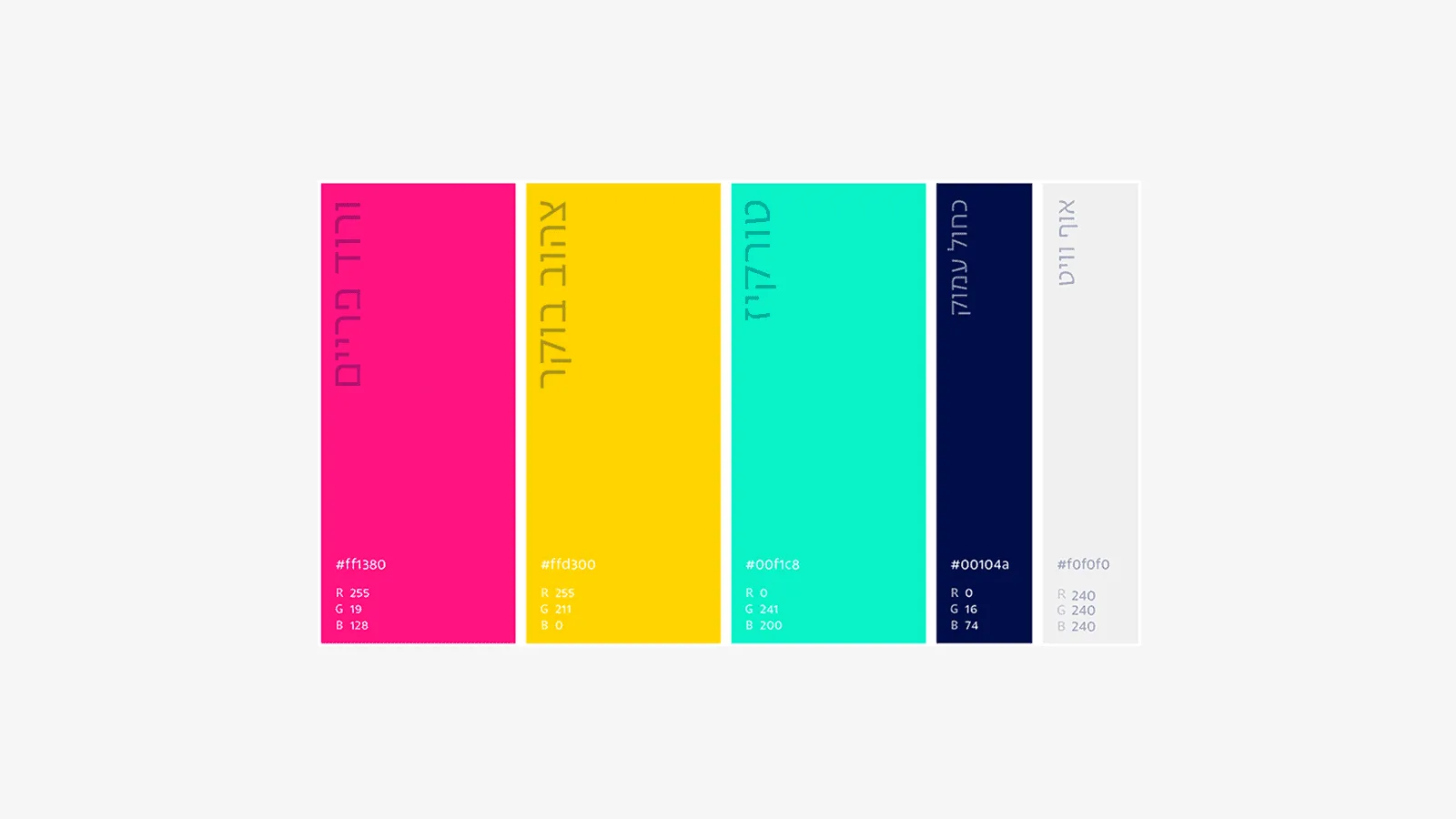
A bold logo for a bold brand: basic shapes and a confident, pastel-led palette form a flexible visual identity.
The system
A full brand book and channel kit — logo usage, color, typography and on-air functionality — covering every surface a network broadcasts on, so the identity stays consistent across news graphics, promotion and continuity.
The outcome
The identity went on air as a complete national broadcast system — logo, brand book and channel kit governing everything the network shows, every hour it is on air.
Role & contribution
I shaped the brand strategy and designed the identity — logo, color and typography — then built the brand book and channel kit that carry it on air, working with Shortcut Playground on the broadcast application.

Film
A reel of the Channel 13 identity in motion — the mark assembling from its coloured parts, and the colour and typography as they run on air.
Credits
Creative Agency — Shortcut Playground
Engagement Brand Strategy & Identity Systems
Next project
 Amdocs — Make It Amazing →